Above-the-Fold Framework & Messaging Hierarchy
“Clarity beats persuasion when you only get one screen.” — Dependable Consulting
Introduction:
Above-the-fold (ATF) is where belief is made or lost. In ~3–7 seconds, a visitor decides whether to scroll, click, or bounce. This post gives you a repeatable framework and message hierarchy that turns first-screen attention into action—tool-agnostic, built for marketing and SaaS offers.
With that said, here are 8 essentials for a high-converting above-the-fold section 👊
1. Start with a Message Map (who → pain → outcome → offer)
Define the ICP and the job they’re hiring you to do. Write a one-line promise using this pattern:
“For [ICP] who [pain], we deliver [outcome] in [timeframe] without [common objection].”
Examples:
“For insurance agencies who drown in no-shows, we lift kept appointments in 30 days without switching CRMs.”
“For B2B SaaS teams stalled at PQL → SQL, we double qualified demos in one quarter without discounting.”
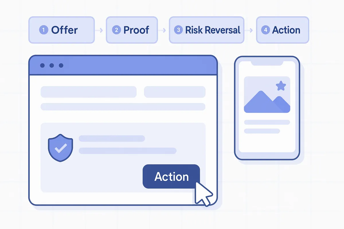
2. The ATF Anatomy: Offer → Proof → Risk Reversal → Action
Put these four elements in this order on the first screen:
Offer: headline/subhead that names the outcome and the mechanism.
Proof: a number, logo row, screenshot, or brief testimonial (one line).
Risk Reversal: privacy or guarantee line (and compliance badge if needed).
Action: one primary CTA (book, start trial, get audit) and one soft CTA (download, watch, learn).
3. Headline & Subhead That Create Belief (not just hype)
Headline: outcome + qualifier (“Kept-Appointment Growth for Insurance Agencies”).
Subhead: mechanism + specificity (“Sequenced reminders, SLA enforcement, and no-show rescue that raises kept rates 15–30%.”)
Avoid empty adjectives. Use numbers, timeframes, or constraints that reduce ambiguity.
4. Visual Hierarchy & Read Order
Design for a Z-pattern read: Logo → Headline → Visual → CTA. Use one focal image (product UI, flow diagram, or outcome chart). Maintain 3–4x spacing around the CTA so it doesn’t blur into other elements. On mobile, stack: headline → subhead → CTA → proof.
5. Form UX & Micro-Frictions (if you place a form ATF)
Ask only what you need to fulfill the next step. Prefer email + first name; defer qualification to step two. Use inline validation, native keyboards (tel/email types), and auto-formatting. Add microcopy that reduces anxiety: “No spam. Cancel anytime.” Each extra field needs a revenue reason.
6. Social Proof That Signals Fit (one line, not a wall)
Choose proof that mirrors your ICP and promise: a metric (“32% lift in kept demos”), a recognizable customer logo, or a one-sentence testimonial. If regulated, include a small disclosure link (“Results vary. See assumptions.”).
7. Risk Reversal & Safety
Reduce perceived downside: short guarantees, sample deliverables, or a precise scope statement (“Free 20-minute teardown, zero pitch”). If you collect data, include a privacy line and link. If compliance matters (TCPA/A2P, HIPAA, etc.), add the appropriate badge with real policy links.
8. Test Cadence & Guardrails
Test one lever at a time: (A) headline/subhead, (B) hero visual, (C) CTA copy/placement, (D) form length. Guardrails: don’t ship a variant that loads >2s slower or hides the primary CTA on mobile. Success metrics: hero CTR, scroll depth, conversion rate, and qualified-lead rate (not just raw form fills).
Other resources to help you help you build ATF that converts
Kept-Appointment Economics (why your CTA should optimize for “kept,” not “booked”)
Form UX & Micro-Frictions (field audit and error-state patterns)
Booking Page Patterns (how the next step supports the promise you made)
Demand Gen Attribution Framework (measure the real lift, not vanity)
Revenue-Ready CRM Architecture (so your ATF data actually lands in reports)
Start your own ATF checklist:
Write the message map (ICP → pain → outcome → offer) and a one-line promise.
Draft headline + subhead using specificity (numbers, timeframes, or constraints).
Place Offer → Proof → Risk Reversal → Action in that exact order on the first screen.
Choose one focal visual that clarifies the mechanism (UI, diagram, or outcome).
Decide on form vs button; if form, keep it to must-have fields with inline validation.
Add one-line proof that mirrors your ICP; include a small disclosure link if needed.
Write a clear risk-reversal line (privacy/guarantee) and link to policy details.
Ship Variant A/B with a single change; monitor hero CTR, scroll depth, CVR, and qualified-lead rate for a full traffic cycle before declaring a winner.
