Form UX & Micro-Frictions
Systematize creative testing to learn faster without wrecking the account.
Download the Testing Matrix
A reliable testing system turns creative into compounding advantage. Instead of guessing which hook or layout “might” work, you move through a disciplined loop: form a hypothesis, ship structured variants, collect enough data to decide, and roll insights into the next sprint—without blowing up CPA or fatiguing audiences. Use this playbook to operationalize that loop across Meta, TikTok, YouTube, and programmatic.
Hypotheses → variants (angle, format, hook, proof)
Turn ideas into testable statements before you open Ads Manager.
How to write a crisp creative hypothesis
Angle: What belief or unmet need are we addressing?
Example: “Prospects distrust generic ‘save money’ claims; a time-back angle will lift CTR.”Format: What visual/container will best deliver that angle (UGC selfie, product demo, motion graphic, carousel, story)?
Hook: The first 1–3 seconds (video) or top 2 lines (static) that force a stop.
Proof: What evidence increases credibility (testimonial, quantified outcome, demo timestamp, certification/badge, press, before/after)?
Translate into variants
Angle set: Time-back vs. risk-reduction vs. status/identity vs. social proof.
Format set: 9:16 UGC selfie vs. 1:1 motion graphic vs. 16:9 demo cut.
Hook set: “Stop doing X” | “I tried Y for 7 days” | “The 3-minute fix for Z.”
Proof set: On-screen metric (e.g., “$312 saved in month 1”), real customer name + face, third-party logo, or short “live” screen capture.
Make variants meaningfully different. Small color tweaks rarely create learning. Change one dimension at a time (angle or format or hook or proof) so you can attribute the lift.
Naming convention (recommended)W05_Angle-Status_Format-UGC_Hook-3minProof_Proof-CaseStudy_v1
This keeps your matrix scannable and your learnings attributable.
Sprint cadence (weekly) and sample sizes
Weekly sprints keep momentum without whiplash.
Monday
Finalize prior-week readout: winners, losers, “needs more data.”
Select 2–3 learning objectives (e.g., “Validate time-back angle”, “Compare UGC vs. motion graphic”).
Brief production on 4–8 variants that cover this week’s matrix cells.
Tuesday–Wednesday
Launch in learning ad sets (separate from your stable “money” ad sets).
Ensure budgets set to collect minimum viable data within the week.
Thursday–Friday
Monitor guardrails (CPA, frequency, CPM spikes) and creative fatigue.
Pause clear losers early if they’re burning budget without approaching sample minimums.
Saturday–Sunday
Let delivery stabilize. Don’t yo-yo budgets unless a guardrail trips.
Minimum sample-size rules of thumb (fast, directional)
Thumb-stop/Hook tests (video): ≥ 5,000–10,000 impressions per variant and ≥ 100–150 three-second views to compare hook hold.
CTR/CVR screeners (static or short video): ≥ 100–150 clicks per variant before calling CTR.
Down-funnel decisions (add-to-cart, lead, purchase): Target 50+ conversion events per variant for a confident read; if volume is low, use cost-per-unique-landing and qualified lead rate as interim signals.
Tip: If your daily volume can’t hit those thresholds across many variants, test fewer at a time. Depth beats scatter.
Budgeting shorthand
Estimate CPC (or CPM + expected CTR).
Back into clicks needed × CPC = test budget per variant.
Multiply by # of variants to size the sprint. If it’s too high, drop the matrix to the most decision-driving cells (e.g., angle first, format next).
Guardrails: CPA-kept, frequency, fatigue
Testing should never torch your blended performance.
Account-level guardrails
CPA-kept: Blended CPA across all ad sets must stay within ±15% of your trailing 14-day baseline. If you exceed, pull from testing budget first.
Budget cap for learning ad sets: 10–20% of total spend, scaled with revenue headroom.
Auction sanity checks: CPM spikes > 40% week-over-week indicate targeting or seasonality, not creative.
Ad-set/creative guardrails
Frequency caps (platform-dependent): Aim for <2.5 weekly on prospecting tests; if you pass 3–4, fatigue risk rises—rotate hooks or audience.
Early kill-switch: Any variant with 2× baseline CPC after 1,000 impressions and no signs of downstream engagement can be paused early.
Negative feedback rate (where available): If > 2× the ad-set median, pause and review copy/claims.
Fatigue detection
Cohort CTR decay: If CTR drops >25% after day 3 with stable CPM, the hook has worn out.
Creative life estimator: Track each creative’s days-to-20% CTR decay. Use this to forecast when a theme will need refresh.
Cross-channel learning repo
Insights compound when centralized.
What to log (simple schema)
Meta: Date, campaign objective, audience, placement bundle.
Creative DNA: Angle, format, hook text, first 3 seconds transcript, proof element, CTA copy, length.
Metrics: CPM, CTR, CPC, LPV rate, CVR, CPA, ROAS (or cost/qualified lead).
Call: Winner / loser / inconclusive + why (e.g., “Hook too vague,” “Proof elevated trust,” “Format mismatch on Stories”).
Repo options
Start with a shared spreadsheet (columns above).
Graduate to a Notion or Airtable base with thumbnails, short clips, and tags.
Add a “Greatest Hits” gallery your team can reuse when a theme wins.
Rituals
Weekly 20-minute win review: Play top 2–3 creatives; discuss what made them win.
Monthly theme synthesis: “Which angles won across channels? Which formats consistently underperform?”
Hand-off to CRO (landing page sync)
Creative drives the click; CRO captures the intent. Ship learnings downstream.
How to sync
Message match: Mirror the winning hook and hero claim on the landing page (headline, hero visual).
Proof parity: If the ad’s proof is a quantified testimonial, put that artifact above the fold.
Speed & layout: Winning short-form UGC often pairs best with lightweight, scannable pages: clear headline, 3 bullets, single CTA.
Operational hand-off
Create a one-pager per winner: thumbnail, transcript, angle/format/hook/proof tags, and the CRO request (headline variant, hero video embed, social-proof block, form simplification).
Log in a shared backlog with owner + due date so wins don’t stall.
Next step: Download the Testing Matrix to plug these rules into your weekly workflow—complete with sample-size calculator and guardrail checklist.
Form UX & Micro-Frictions
Category: CRO & Offer Pages
Slug: form-ux-micro-frictions
Thesis: Reduce abandonment by fixing the tiny things that break trust.
CTA: Run a 10-Minute Form Audit
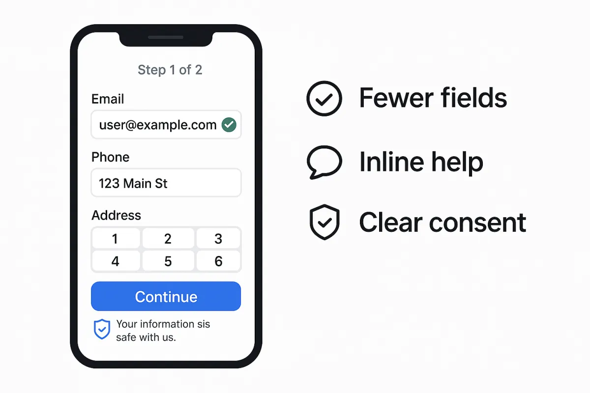
High-intent users abandon forms for small, fixable reasons: the wrong keyboard pops up, an error message feels accusatory, the form asks for too much too soon, or the consent language looks scary. This guide focuses on surgical, high-ROI tweaks that preserve trust and completion rate—especially on mobile.
Field minimization & progressive profiling
Fewer fields = fewer exits. Start with the minimum viable dataset to fulfill the promise of the page, then collect more later.
Baseline rules
Collect only what you immediately use. If sales won’t call today, don’t ask for phone today.
Collapse name fields to one field when possible (“Full name”)—it’s often faster on mobile.
Use progressive profiling: On the 2nd–3rd touch (email nurture, in-app), ask role, company size, timeline, etc.
When you “must” ask more
Break into two steps (perceived progress lifts motivation).
Show why you ask (“Phone helps us confirm exact coverage area”).
Offer skip for nonessential questions without blocking submission.
Quick win checklist
Remove any field not essential to deliver the lead magnet, trial, or callback.
Default country from IP; state from ZIP if possible.
For B2B, use company email enrichment post-submit instead of adding firmographic fields upfront.
Error states, inline validation, device keyboards
Errors are UX copywriting moments. Make them fast, specific, and kind.
Inline validation
Validate on field blur (not only on submit).
Show what to fix (“Use a work email like [email protected]”) and how to format it.
Device keyboards (mobile)
Set correct input types:
Email:
type="email"Phone:
type="tel"Number-only fields:
inputmode="numeric"Credit card:
inputmode="numeric" autocomplete="cc-number"Zip:
inputmode="numeric" autocomplete="postal-code"
Error microcopy examples
Bad: “Invalid input.”
Better: “That phone number looks short—try 10 digits (xxx-xxx-xxxx).”
Tone: empathetic, blame the field not the user.
Visuals
Keep error color accessible (contrast ≥ 4.5:1).
Pair color with icons or helper text for color-blind users.
Autocomplete, formatting, accessibility
Autocomplete reduces friction and typos.
Add HTML
autocompletetokens (name,email,organization,street-address,postal-code, etc.).Use input masks that help (e.g.,
(xxx) xxx-xxxx) but don’t block paste or international formats.
Accessibility (the basics)
Every field needs a visible label associated via
for/id.Provide focus outlines (don’t remove them).
Announce errors via ARIA live regions so screen readers catch them.
Maintain label–input proximity; placeholder text is not a label.
Formatting & latency
Debounce any validation that pings a server.
Pre-fill from known data if the user is authenticated.
Keep submit latency snappy; show a spinner + “Submitting…” to reassure.
Privacy microcopy and consent placement
Trust is the strongest completion lever.
Placement
Put privacy assurance beneath the CTA or immediately below sensitive fields.
If you need marketing consent (email/SMS), keep it separate from required terms—and clear.
Microcopy examples
“We’ll only use this to schedule your demo.”
“No spam. Unsubscribe anytime.”
“Message & data rates may apply. Reply STOP to opt out.”
Consent patterns
Unbundled checkboxes: One for terms (required), one for marketing (optional).
Granular SMS/email: Separate consent if you use both.
If you operate in strict jurisdictions, store consent artifacts (timestamp, IP, checkbox text version).
Metrics: start/complete, field time, drop-off map
Measure friction like a product, not a page.
Core metrics
Start rate: Form starts / unique visitors who saw the form.
Completion rate: Submissions / starts.
Field time: Median time to complete each field.
Drop-off map: Which field ends the most sessions?
Error rate by field: Validations triggered / starts.
How to instrument (high level)
Fire a “form_start” event on first keystroke or focus.
Fire “field_focus”, “field_error”, “field_complete” with field name and timestamps.
Fire “form_submit_attempt” and “form_submit_success.”
Build a simple funnel chart (start → submit) and a table of fields sorted by error rate and time.
Prioritization
Tackle fields with high error rate and long dwell time first.
A/B test one friction fix at a time (e.g., enable autocomplete, loosen phone mask, split into 2 steps).
10-Minute Form Audit (how to run today)
Load your top mobile device/OS, throttle to “Slow 3G.”
Attempt the form with fat thumbs—note pain points.
Count required fields; cut one.
Fix input types and autocomplete attributes.
Rewrite the harshest error message to be specific and kind.
Add or improve privacy microcopy.
Ship, then watch start→complete and drop-off map for one week.
Next step: Run a 10-Minute Form Audit and turn your quick wins into permanent gains—then queue deeper experiments (two-step, progressive profiling, and trust badges) for the next sprint.
