Reporting & Dashboards (Exec vs Ops): Two Dashboards, One Truth
Reporting & Dashboards (Exec vs Ops): Two dashboards, one truth
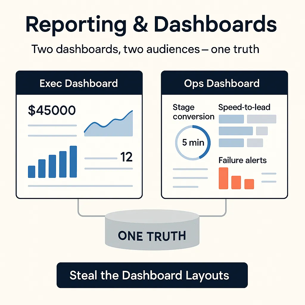
Two dashboards, two audiences—one truth. If you try to make a single dashboard please everyone, you’ll satisfy no one and decisions will slow to a crawl. Executives need fast confidence on the business model (CAC, LTV, payback, runway). Operators need levers and alerts (stage conversion, speed-to-lead, failure detection). The art is splitting views while enforcing one semantic layer, definitions, and cadences so numbers match everywhere.
Below are the two views, the shared spine (data freshness & definitions), and the distribution rhythms that keep both rooms moving.
Exec view: CAC, LTV, payback, runway
Purpose. Give leaders a 30-second answer to “Are we within plan and runway?” Focus on unit economics, growth velocity, and risk signals. Strip out operational detail; elevate model indicators and trendlines.
Layout (one screen).
Top band: headline KPIs
New ARR (or Net New ARR) vs plan (sparkline + plan band)
CAC (last 30/90 days; rolling) with traffic-to-customer context
LTV (gross-margin adjusted) and LTV:CAC
Payback period (months)
Cash runway (months at current burn)
Middle band: trend panels
CAC trend vs target range
Gross margin and churn/NRR trend
Pipeline coverage (next 2 quarters)
Bottom band: risk notes
3 bullets: what changed, why it matters, action in flight
Metric definitions (executive-grade).
CAC = (Sales + Marketing costs for period) ÷ New customers in same period. Keep consistent cost buckets (include wages/overhead or explicitly exclude—just be consistent). See a plain-English breakdown from HubSpot (2024) for reference. (HubSpot)
LTV = (ARPA × gross margin %) ÷ churn rate. When available, use cohort LTV not a blended snapshot.
Payback = CAC ÷ (Gross margin × monthly ARPA) for the average new customer.
Runway = Cash on hand ÷ net burn; show a scenario band if hiring or spend changes.
Target ranges (illustrative bands to localize).
Early/mid-stage B2B SaaS often aims for LTV:CAC ≥ 3:1 and payback ≤ 18 months; adapt to margin profile and sales motion. (Treat these as guardrails, not commandments.)
Visualization do’s/don’ts for execs.
Do use bars for discrete comparisons (actual vs plan), and lines for trends.
Do encode amounts by length/position (fastest to read) and avoid extra color encodings unless they signal threshold breaches—aligns with Nielsen Norman Group guidance (2022) on chart selection. (NN/g)
Don’t mix units in one axis or bury definitions in footnotes; surface the formula on hover or a side legend.
Don’t cram stage-level funnel into this view—send that to Ops.
Action: Want a plug-and-play layout with KPI formulas? Steal the Dashboard Layouts.
Ops view: stage conversion, speed-to-lead, failure alerts
Purpose. Give RevOps/MOPS the levers to hit targets this week: where leads stall, where handoffs fail, and whether SLAs are met.
Layout (one screen).
Top band: SLA & health
Speed-to-lead (median, p90) vs SLA by source
Routing coverage (assigned within X min), show rate for booked calls
Delivery health for email/SMS (bounce/error rate)
Middle band: funnel mechanics
Stage conversion and stage-to-stage speed (lead→MQL→SQL→Opp→Won)
Capacity & backlog (open tasks per rep; meeting slots available)
Source quality (lead-to-SQL by channel/campaign)
Bottom band: failure alerts
Sync errors (CRM/MA) by system + last spike time
Form errors and API/webhook failures
Blacklisted/suppressed contacts movements
Metric definitions (operating-grade).
Speed-to-lead = time from inbound signal to first meaningful touch. Faster matters: the canonical Harvard Business Review study (2011) found contact odds drop sharply after minutes and that average responses were painfully slow; use it as a directional benchmark, then prove it in your data. (HBR)
Stage conversion = (# entering next stage) ÷ (# entering current stage) over the same window; report both % and count so small denominators don’t mislead.
Failure rate (system) = errors ÷ attempts for the last 24h with a 7-day baseline.
Target ranges (start points; localize).
Speed-to-lead: aim for <5 minutes on high-intent inbound; <15 minutes on working hours across the board.
Stage-to-stage: flag any step >2× the median time or conversion <½ of trailing 8-week average.
Delivery health: hard fail if bounce >2% (email) or if carrier error spikes (SMS) exceed trailing p95.
Visualization do’s/don’ts for ops.
Do use funnel bar charts and stacked bars for stage conversion and by-source breakdowns; keep colors consistent across stages.
Do add reference lines for SLA thresholds; red only when breached to preserve preattentive pop (see NN/g’s preattentive-feature advice) (NN/g).
Don’t hide outliers—plot p50/p90 for time metrics, not just averages.
Don’t paginate critical alerts; keep a single scroll with the last 24h of incidents.
Action: Want the exact component list and filters? Steal the Dashboard Layouts.
Data freshness & definitions
If exec and ops see different numbers, trust collapses. Most conflicts come from latency and loose definitions.
Freshness (set expectations by system).
Google Analytics 4 standard property data can take 2–6 hours for intraday updates and 24–48 hours for full processing; realtime fills gaps for quick checks, and BigQuery daily exports can be updated for up to 72 hours as late events arrive. Document this in the dashboard headers. (Google Analytics Help, 2025) (GA4 BigQuery Export)
Ad platforms typically lag <3 hours on most stats; still, treat conversions with caution until attribution windows settle. (Google Ads Help)
Single source of truth.
Define KPIs in a semantic layer (warehouse views/LookML/dbt models) and point both dashboards to the same curated tables.
Lock definitions with versioned docs: name, formula, inclusions/exclusions, data source, refresh schedule, owner.
Naming conventions (examples).
metric.cac_total_monthly_v1— includes wages + overheadmetric.cac_paid_only_v1— excludes wages/overheaddim.stage_current— enumerated list with allowed values and order
Quality gates.
Automated data tests: freshness lag thresholds, null checks on join keys, referential integrity between CRM and MA.
Manual review: weekly spot-checks on top sources, especially when campaigns or routing rules change.
Visualization guardrails for clarity.
Prefer bar/line/scatter over exotic charts; humans read length and position fastest (NN/g, 2022).
Use consistent color mapping for stages and statuses.
Provide hover formulas and last-refreshed timestamps on every panel.
Action: Get our definition template and semantic-layer field list. Steal the Dashboard Layouts.
Distribution cadence and decision meetings
Dashboards don’t move numbers—cadence and ownership do.
Cadence rhythms.
Daily (ops huddle, 15 min). Speed-to-lead, routing coverage, failure alerts. Owner: RevOps lead. Decision: “What do we fix today?”
Weekly (go-to-market, 45–60 min). Stage conversion, capacity/backlog, channel quality, next-week targets. Owners: Sales/Marketing/RevOps. Decision: “What do we test/change this week?”
Monthly (exec, 60–90 min). CAC/LTV, payback, NRR/churn, margin, runway and hiring scenarios. Owner: CFO/CMO/CRO. Decision: “Are we within plan? What do we re-allocate?”
Quarterly (board). Same exec view with a narrative: what shifted, why, what we’re doing.
Pre-reads & hygiene.
Send a one-page digest 24 hours in advance with: KPI deltas, three causes, three actions. Link to both dashboards; never paste screenshots without the refresh timestamp to avoid “stale slide syndrome.”
Use decision logs (date, decision, owner, metric target) linked from the dashboard.
Meeting choreography (keep it crisp).
Start with the question (e.g., “Do we still pay back in ≤12 months?”).
Open the exec dashboard for the answer; if off-track, jump to the ops dashboard for the lever.
Assign the change, set the test window, document the expected movement and the readout date.
Common failure modes to avoid.
One dashboard to rule them all. Creates clutter and arguments. Split the views.
Undefined time windows. Mixes 7-day, 30-day, and month-to-date cutoffs. Standardize.
Silent definition drift. Marketing counts trials; finance doesn’t. Version and publish every definition.
No refresh time. Every screenshot must show “Last refreshed: <timestamp>.”
Action: Use our agenda template and digest outline. Steal the Dashboard Layouts.
Sources used — Google Analytics Help (2025); Google Ads Help (2025); HubSpot (2024); Nielsen Norman Group (2022); Harvard Business Review (2011)
